Mark Unread · iOS feature
Gone are the days of “left on read”
My role
UI design, research
Duration
May 2022
My scope
Integrate into existing design system
Impact
Validated by iOS 15
Bro, you left me on read?
Note: This solution was proposed before the official iOS 15 update
As a long-time iPhone user and notoriously “bad texter,” I considered why I would often forget to reply to texts until several days later when a follow-up message comes through, or I suddenly remember our chat in a panic.
With this pain point in mind, I sought to discover whether a mark unread feature would aid users in responding to forgotten texts faster.

Problem
Misunderstandings and miscommunication can arise when people open but forget to respond after looking at a text message.
As I talked to fellow “bad texters,” I realized we all wanted to address this pain point as it would cause frustration with ourselves and others.
Solution
How might we introduce a solution that integrates seamlessly into iPhone existing design system and haptics?
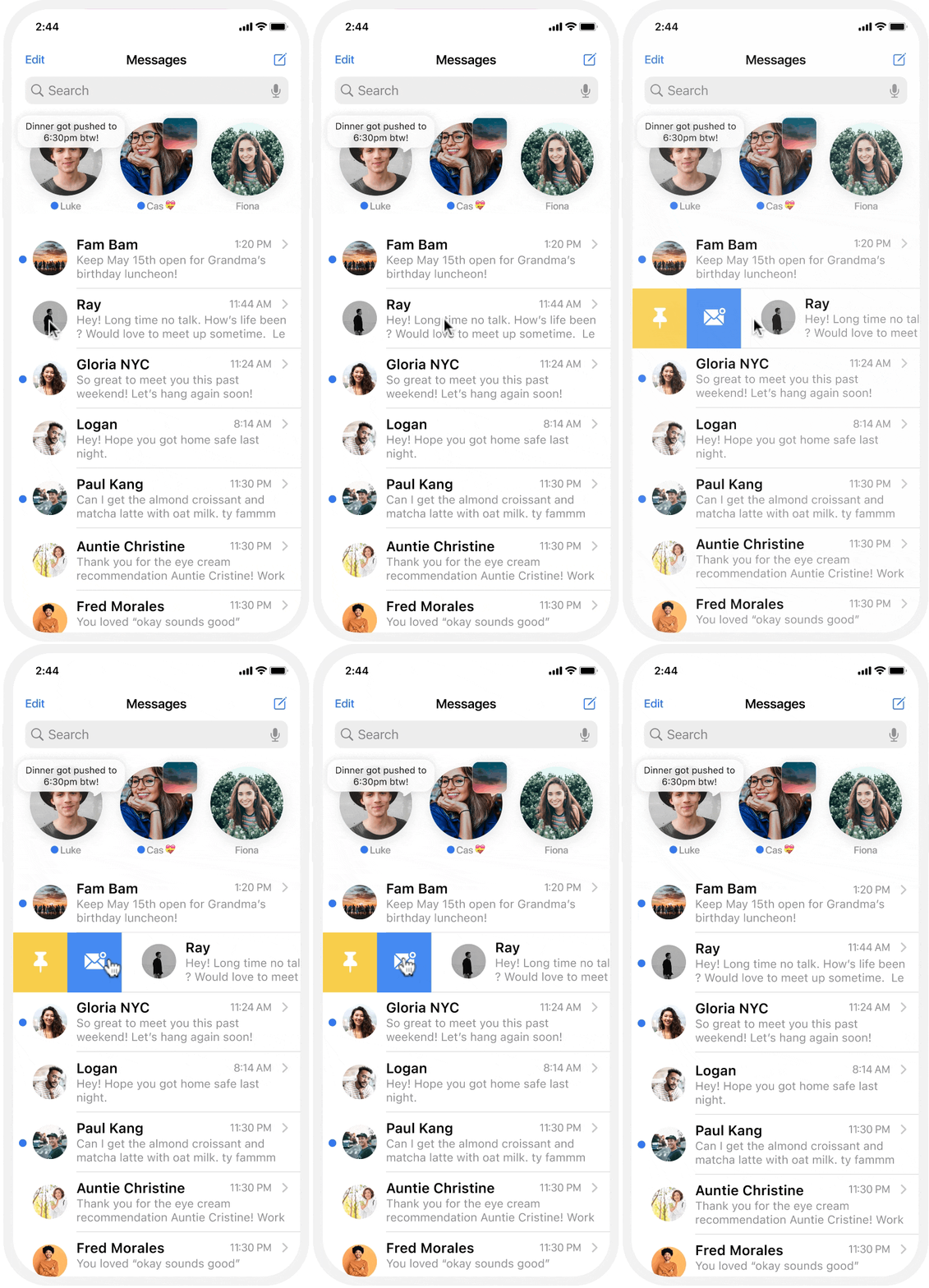
Swipe Left
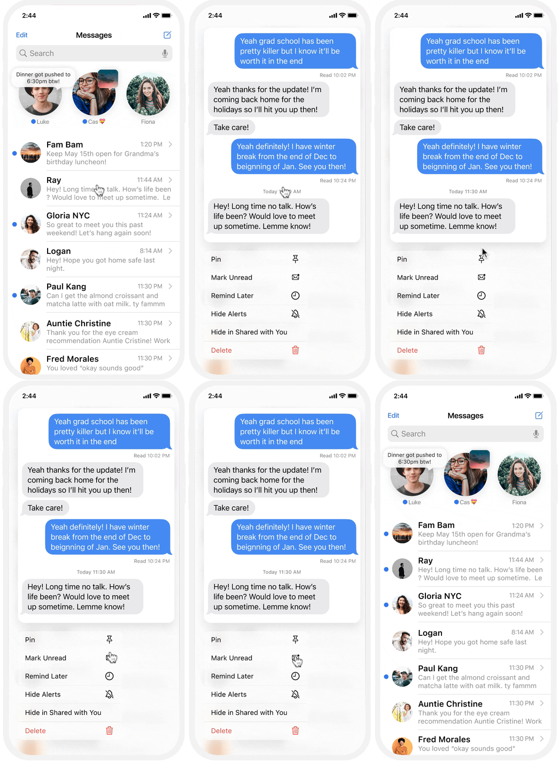
Long Press
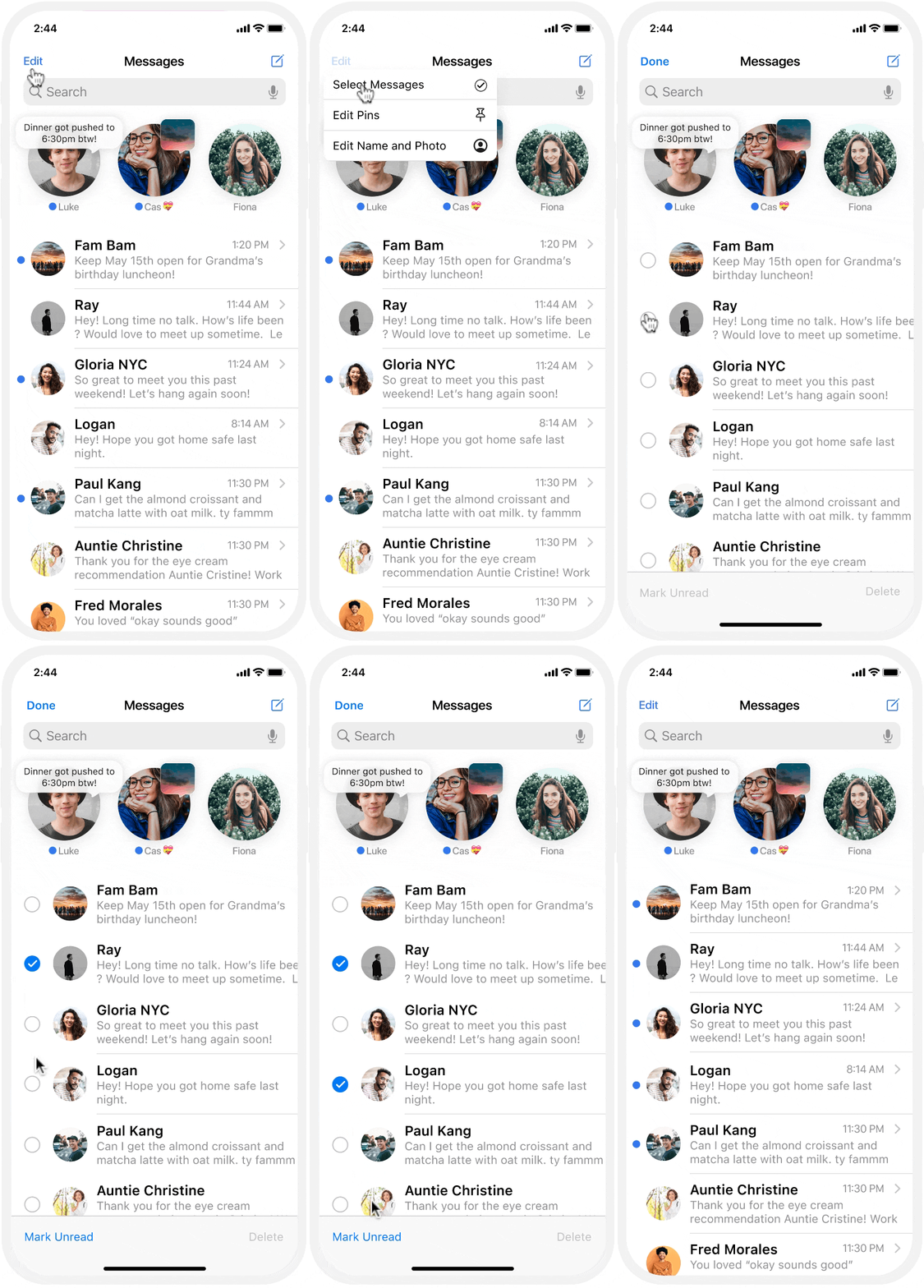
Multi- Select
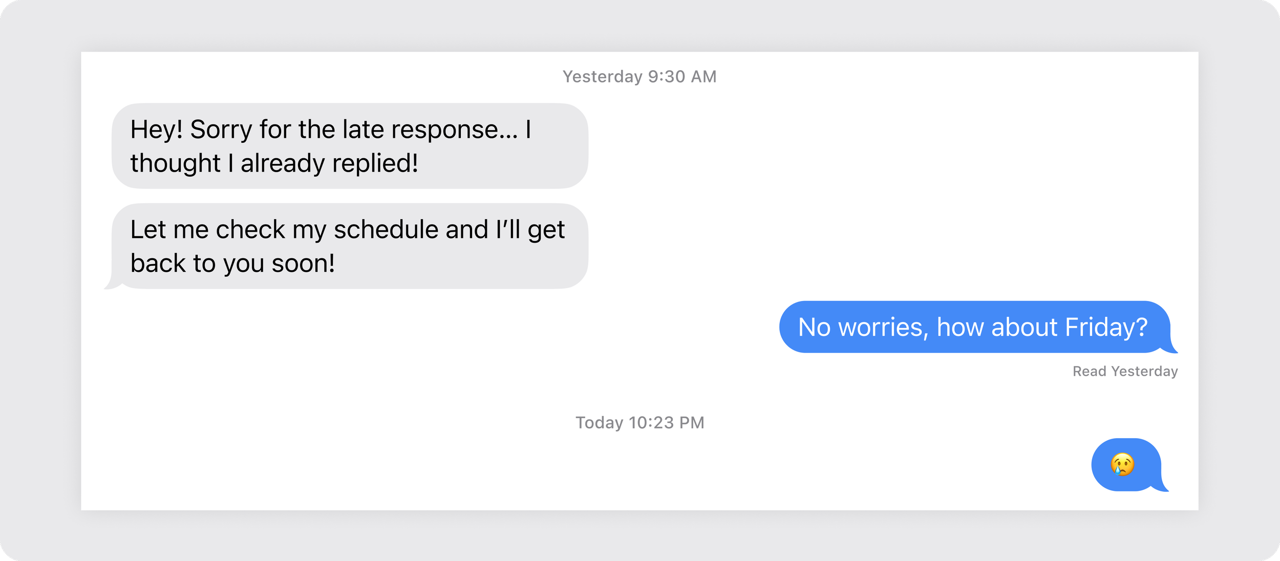
In- Message
Discovery
A simple Google search results page will populate multiple opinion pieces expressing the qualms of users who desire such a feature.
User interviews further validated this assumption.
How does this not already exist?
A highly saturated market of competitive mobile messaging apps possesses dynamic and nuanced communication features that allow users to delete/recall, mark as unread, and remind.
The utility of these features is clearly well-appreciated among users as they were referenced several times throughout my user interviews when I sought to learn how users hope to remember their unresponded texts.
User Interviews
5 lead user interviews uncovered that users are already using existing iPhone features to compensate for this need.
Ultimately, I learned that
Users desire an easy and intuitive feature to remind themselves of unresponded text messages for clear and timely communication.
Research Findings
Generative user research conducted with 5 participants unveiled that users desire a simple and seamless feature that surfaces unresponded but opened texts.
Oops
In a brainstorm with my mentor, I realized that I may have pushed a biased solution.
Given that this was my first self-led project, I got lost and approached my interviews with potentially leading questions that skewed toward particular solutions inspired by existing email features such as “mark unread” and “remind later”.
Despite the devastation (dramatic, I know), I was advised to revisit my interviews and affinity maps in hopes of drawing out other patterns of user needs. I deliberated whether one or both features would be kept.
Who are we designing for?
How might the way users prefer to interact with notifications directly influence how they receive and process incoming texts?
Therefore…
Would two different features: Mark Unread and a Remind Later iMessage feature address the unique need of both personas respectively?
Mark Unread
Would restoring the blue dot notification be effective enough for Eden to remember to respond to missed text messages?
Remind Later
Would a remind later notification trigger enough alert for Kennedy to differentiate among her sea of notifications?
User Flow
Despite the hiccup, I decided to continue with these two solutions in the user flow to validate during user testing after the new revelation from the personas.
Based on the assumption of the personas and their motivations, a user flow with two options was created for users after deciding not to reply: mark unread or remind later. (click to expand)
Ideation
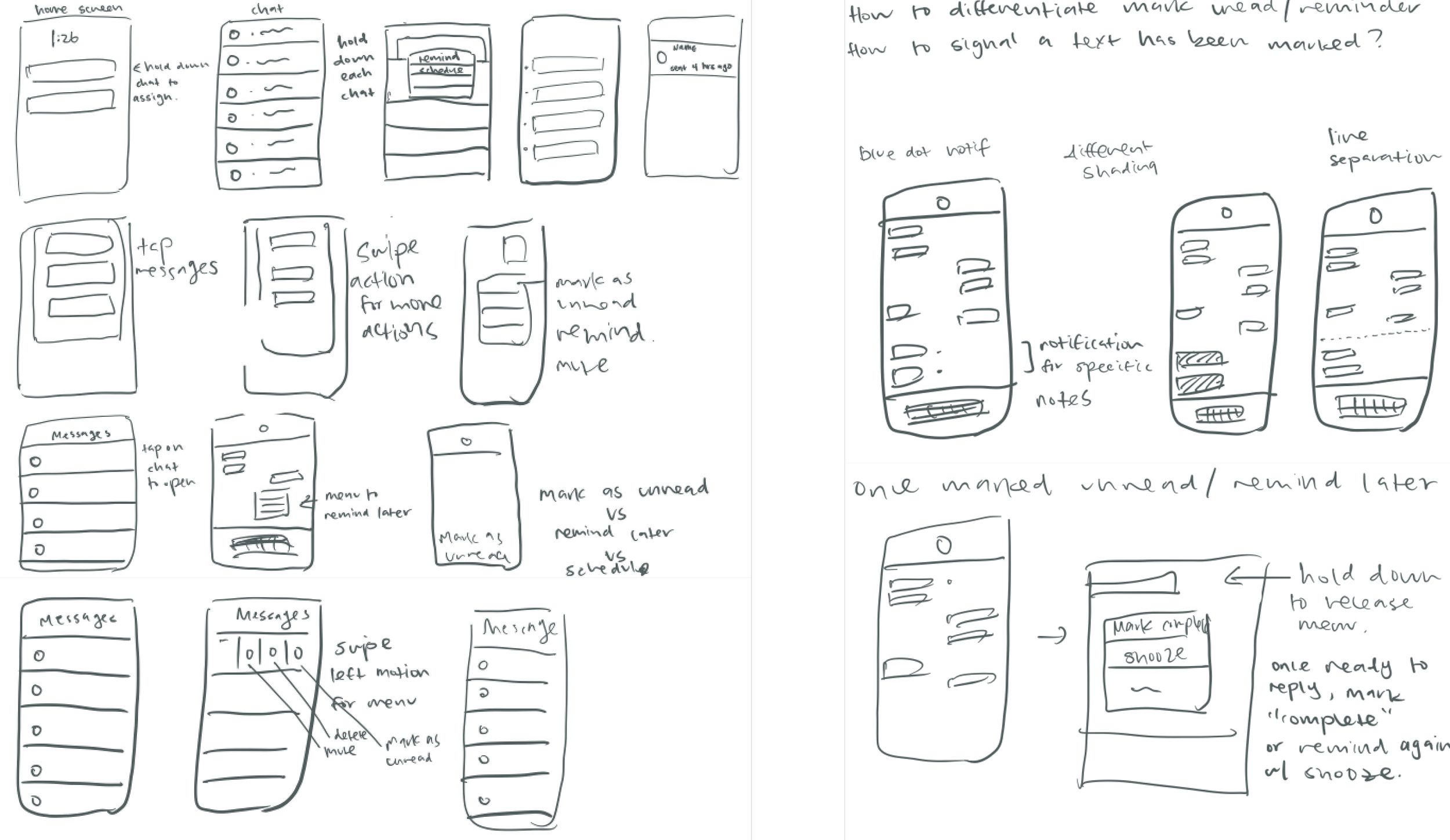
Before sketching, I explored different haptics:
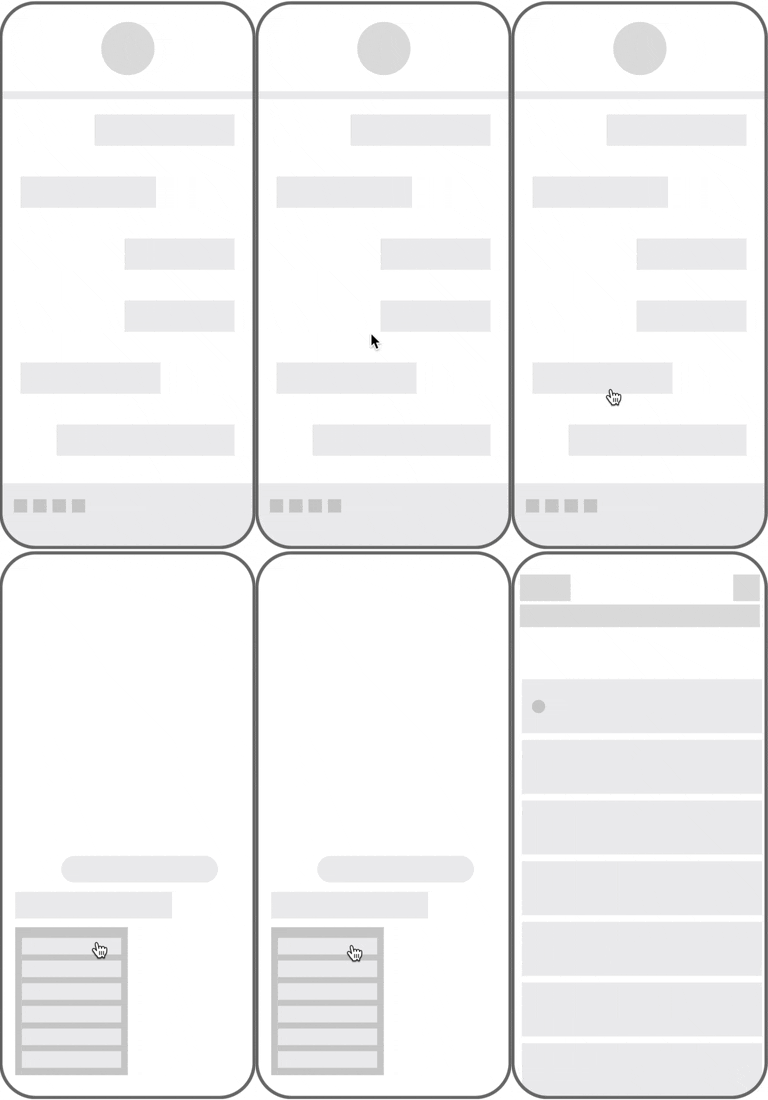
Swipes, long presses, and menus - are utilized to create simple and fluid actions in iMessage for users to make a quick decision with a quick action.
Wireframes + Polish
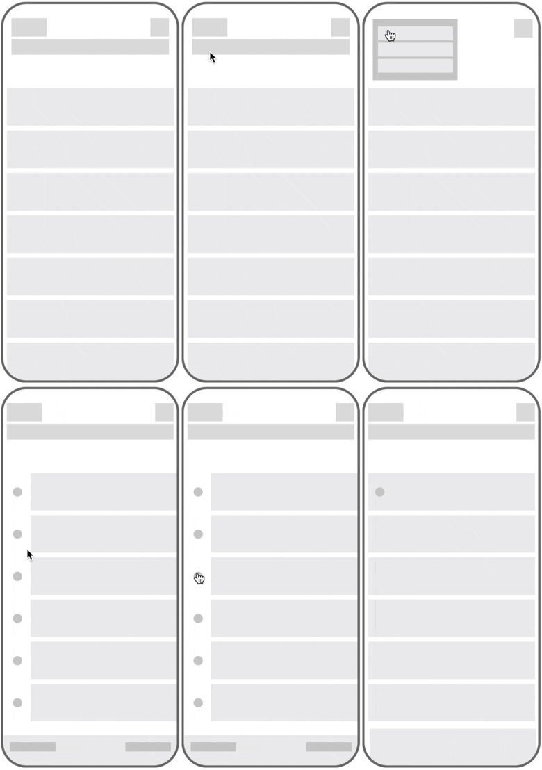
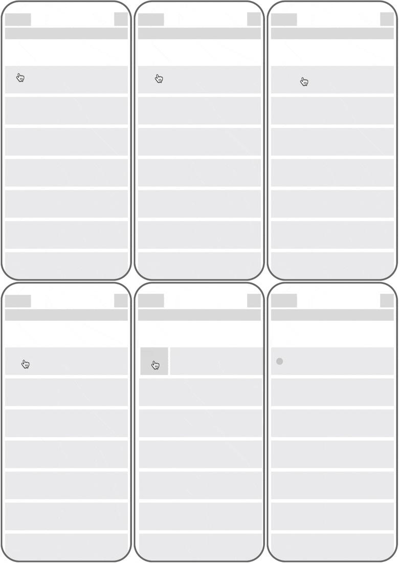
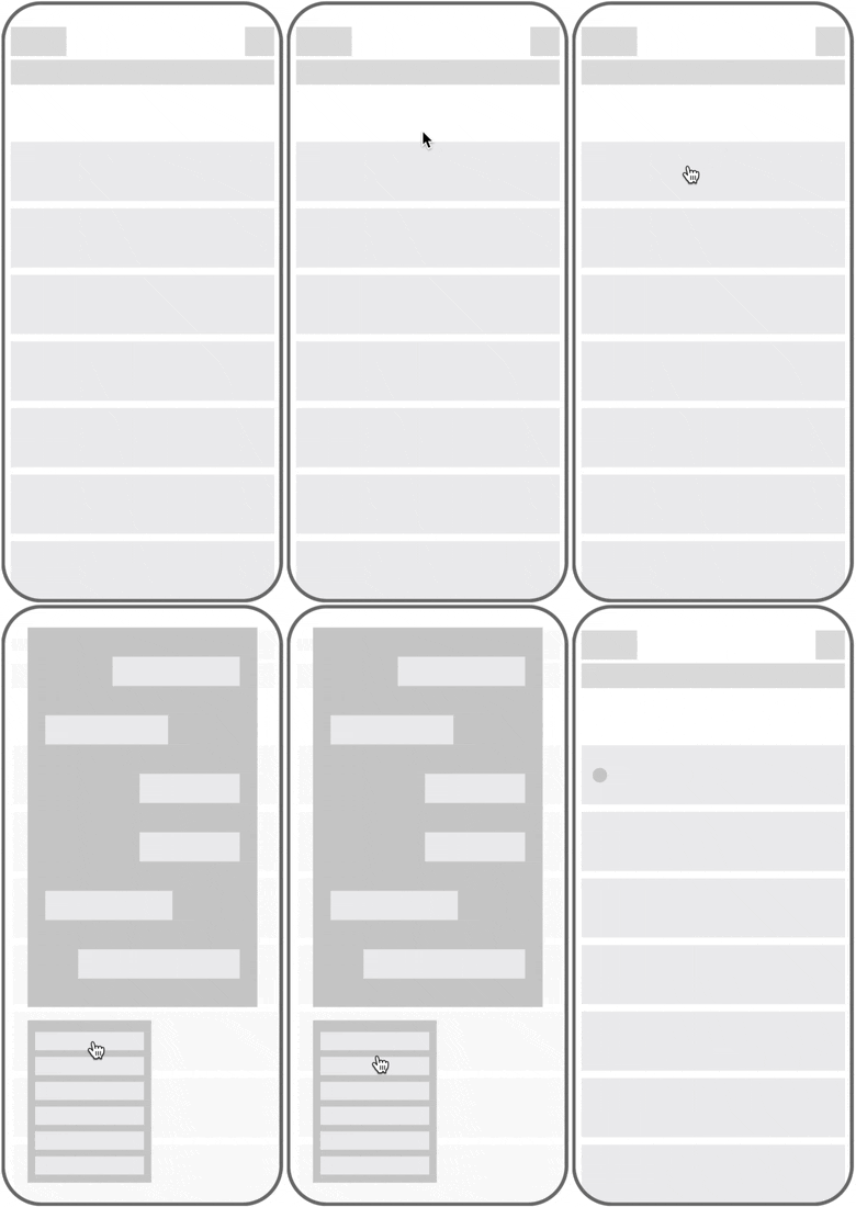
I drafted some rough wireframes to explore the interaction design of the existing haptics that iMessage already had.
Then, I used the existing iOS design system to produce hi-fi prototypes for usability testing.
Select Multiple
Swipe Left
Long Press
In Chat
Prototype and Testing
The main objective was to observe how users intuitively expect to cue texts they haven’t responded to yet.
Since iOS already had an existing design system, I was able to leverage those components to make a hi-fi prototype. Usability testing was conducted in person on a mobile device with the Invision prototype, with 5 participants testing different haptics for messages to “mark unread” and/ or “remind later” from various access points.
Key Findings
Mark Unread performed as expected, with 100% of participants successfully marking a message as unread. The Remind Later notification will need a redesign and more exploration of how it behaves.
While I expected the Remind Later feature to be more of an edge case, I was surprised by how the user feedback was consistent with my assumption that the Remind Later feature would still be utilized depending on user preference with notifications.
Iterations
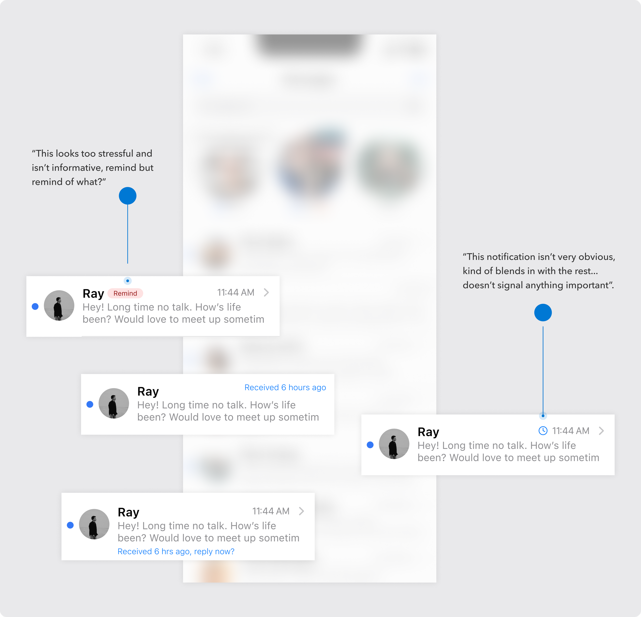
I worked within the iOS design system to explore different notification styles that looked different from the typical text coming in to serve its purpose as a reminder.
Usability testing revealed how users found certain notifications distressing or not obvious enough.
Remind Later feature
Timer Customization
Users felt limited with the time options after assigning texts as Remind Later as they may not be available at such set times.
Users classify Remind Later texts as more important or time-sensitive therefore they would be more willing to invest more thought and customization to ensure they are available to respond at the appointed reminder time.
Post- Usability Test Iterations
Final
Polish
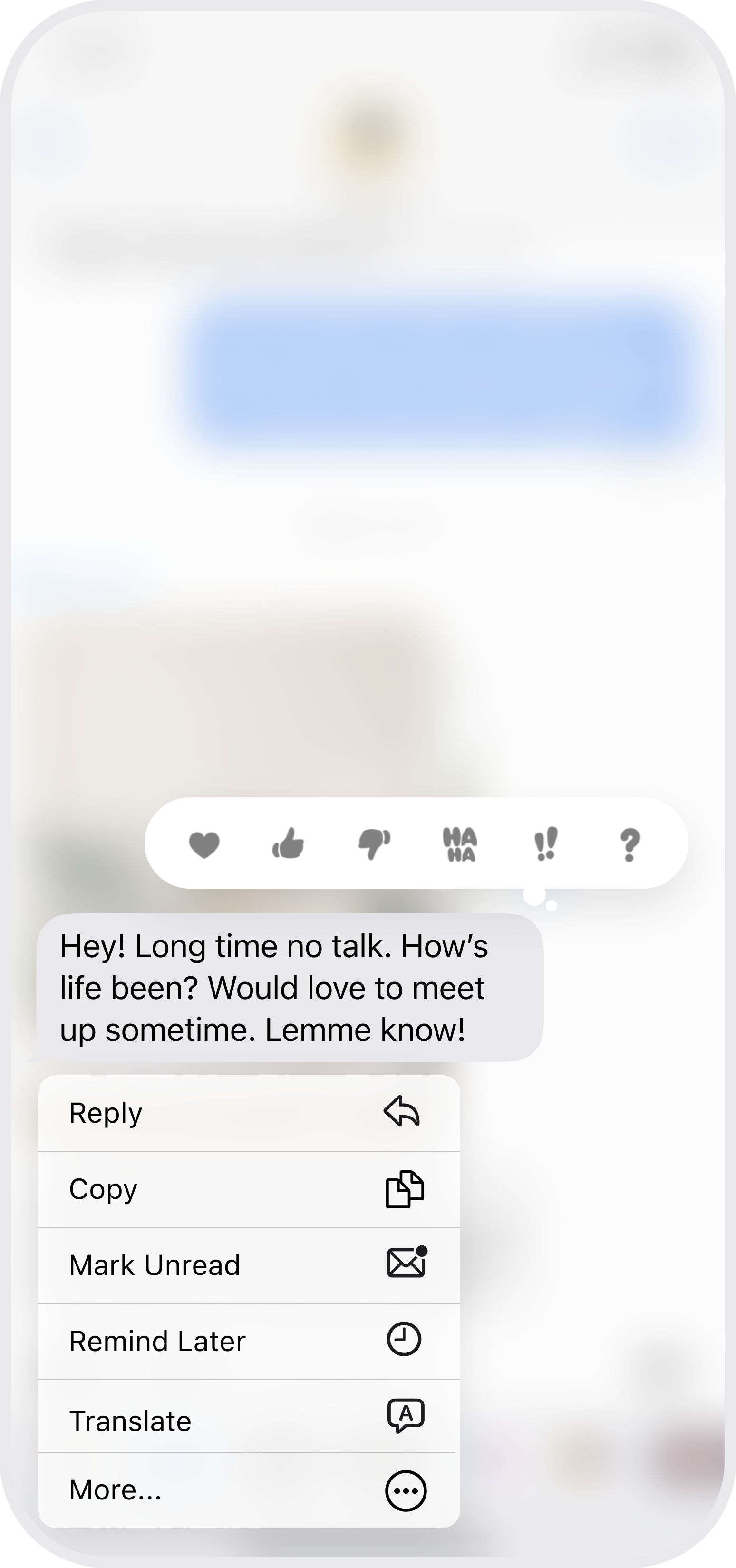
The final product allows the user multiple entry points to mark a message as unread and assign a message as Remind Later.
Swipe Left
Long Press
Multi- Select
In- Message
Remind Later
What I learned
Discover the problem.
Seems like a no-brainer, right? Then came the dreaded “bias” pointed out by my mentor. With the prompt being “added feature to existing product”. I realized I had decided on the solution before researching and validating my assumption of the problem. Unfortunately, I had already conducted my user interviews before realizing that I might have possessed a biased view in approaching my interviews and asked follow-up questions that skewed toward these particular solutions.
Next Steps
I want to continue to iterate upon my reminder solution. I feel like the UI could be improved to be more seamless and consistent with the rest of the iOS design system.

